Summary
As a UI/UX Designer and developer, I worked on creating Fitness&Life, a portal aimed at promoting a healthier lifestyle through accessible and motivating content. My goal was to develop an intuitive and engaging experience, ensuring users could find reliable information about exercise, nutrition and wellness in a clear and inspiring way. Note that the site content is fictional, intended only to simulate a case study.
With a design focused on usability and the reader's experience, I structured the blog to facilitate navigation and encourage action, making the journey toward change simpler and more accessible.
The Challenge
Create a health portal that centralized content about exercise, nutrition and wellness in a clear, responsive and engaging experience — with intuitive navigation, a real stories section and category filters, encouraging readers to explore and apply tips in their daily lives.
Fitness&Life
Fitness&Life is a portal dedicated to health, wellness and quality of life, offering accessible and reliable content about physical exercise, nutrition and healthy habits. With educational articles, practical tips and real transformation stories, the blog aims to motivate and guide people who want to adopt a healthier lifestyle, regardless of their experience level.
Style Guide
From the start, attention to the style guide was fundamental. I chose the Inter typeface, known for being exceptional for mobile applications and on-screen reading. The chosen colors followed a harmonious palette that reflected the vibrant identity of the app, ensuring visual consistency across all sections.
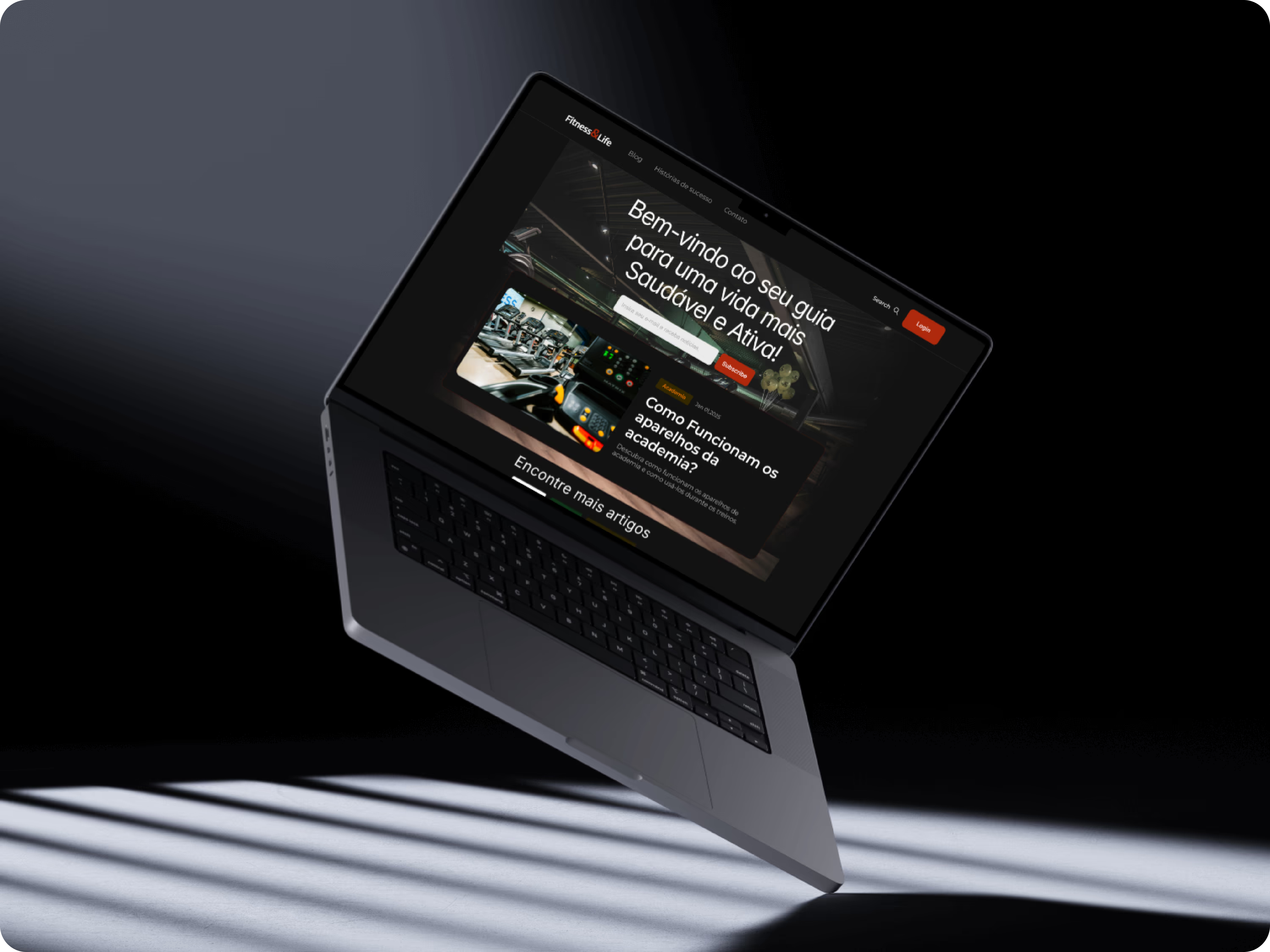
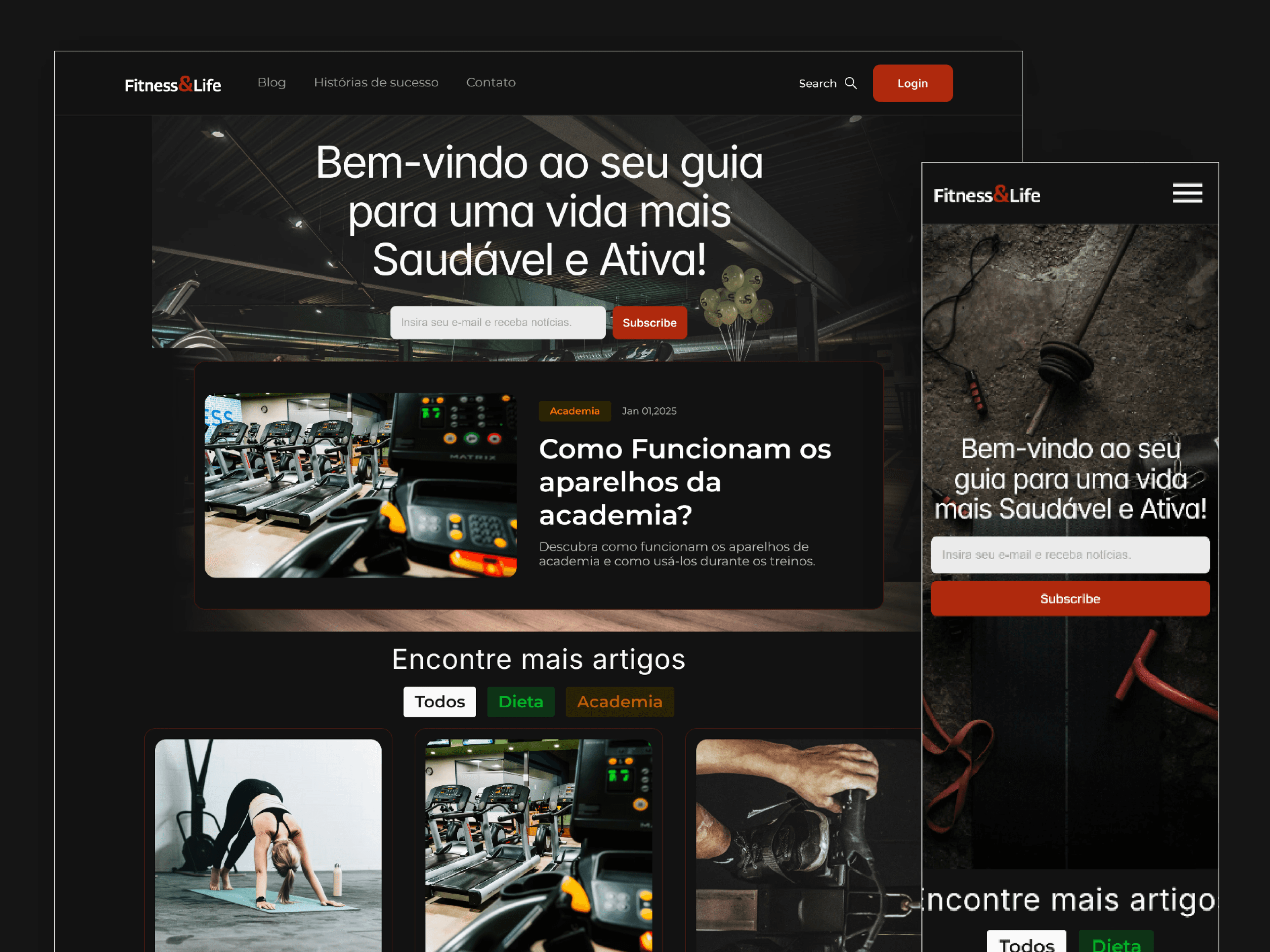
Portal on desktop — "Welcome to your guide for a healthier and more active life!"
Site Design
The Fitness&Life design was conceived to offer an intuitive and organized experience, facilitating navigation and access to the most relevant information for each user.
The blog structure is divided into two main sections:
- Content Section — Articles are clearly categorized, allowing readers to filter by topics such as Exercise, Nutrition and Wellness. There are specific filters for different experience levels, such as beginner and advanced, ensuring each visitor finds content suited to their needs.
- Stories Section — An area dedicated to real stories of people who transformed their lives with new healthy habits. These narratives serve as inspiration for readers, showing that anyone can achieve their goals with the right guidance.
The design relies on a clean and responsive interface, with legible typography, inspiring images and strategic calls to action, encouraging readers to dive deeper into the content and apply the tips in their daily lives.
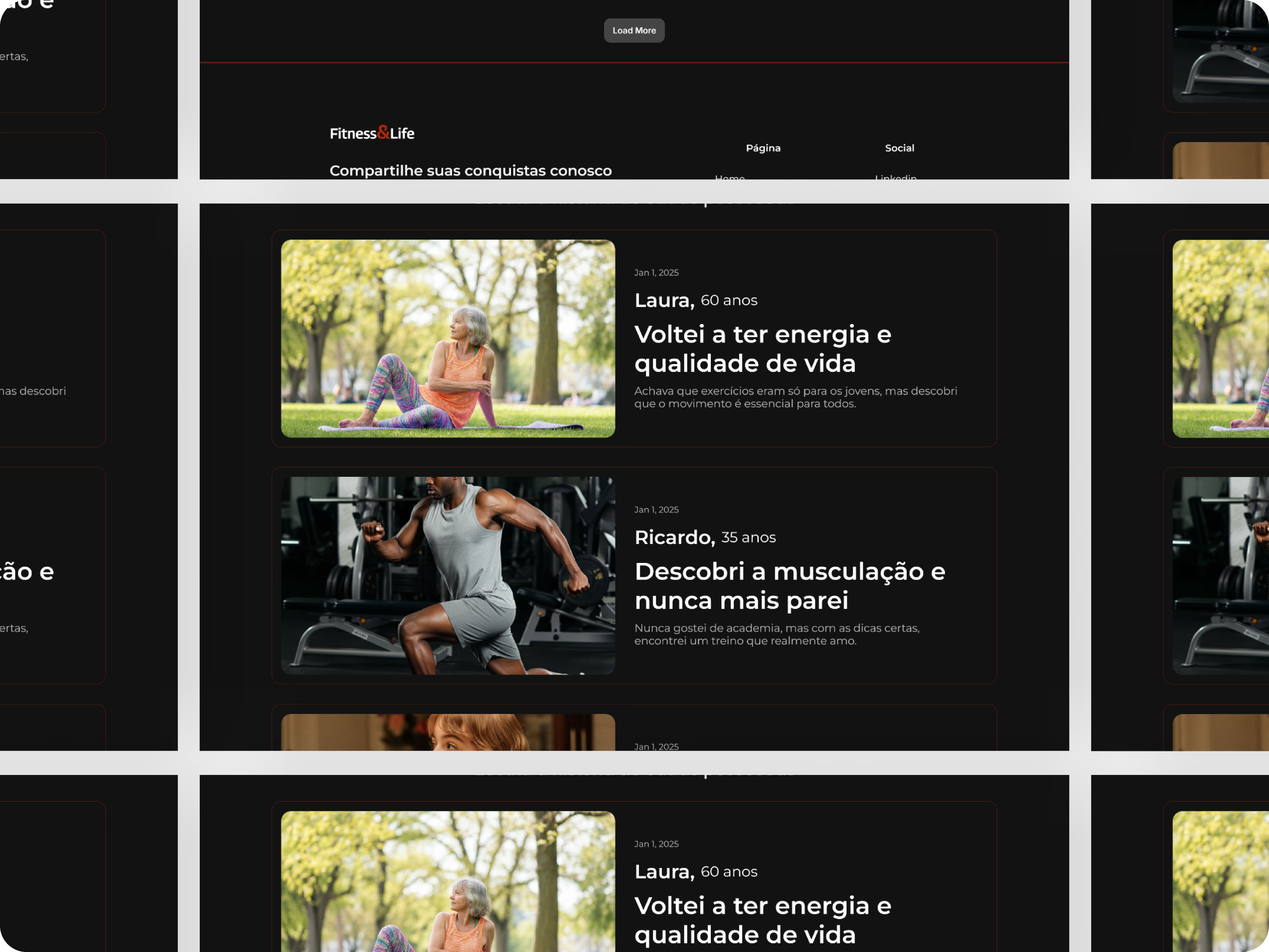
Stories section — real transformation stories as inspiration for readers
Conclusion
After building this entire website, I can say that this journey was extremely enriching, providing great learning about Framer and its advanced tools for creating interactive websites. Throughout this project, I put into practice various concepts and techniques that strengthened my understanding of modern and responsive design.
I used style guides to maintain visual consistency across all sections, ensuring the site's identity remained cohesive and attractive. I worked with a strategically chosen color palette that not only reflected the vibrant identity of the app, but also helped highlight important elements such as call-to-action (CTA) buttons and featured sections. The careful application of CTAs was key to guiding the user intuitively and encouraging them to interact with the content.
The entire process taught me the importance of creating interfaces that are not only visually attractive, but also functional and conversion-focused. The experience with Framer gave me more confidence and skill to develop future projects with greater creativity and precision.
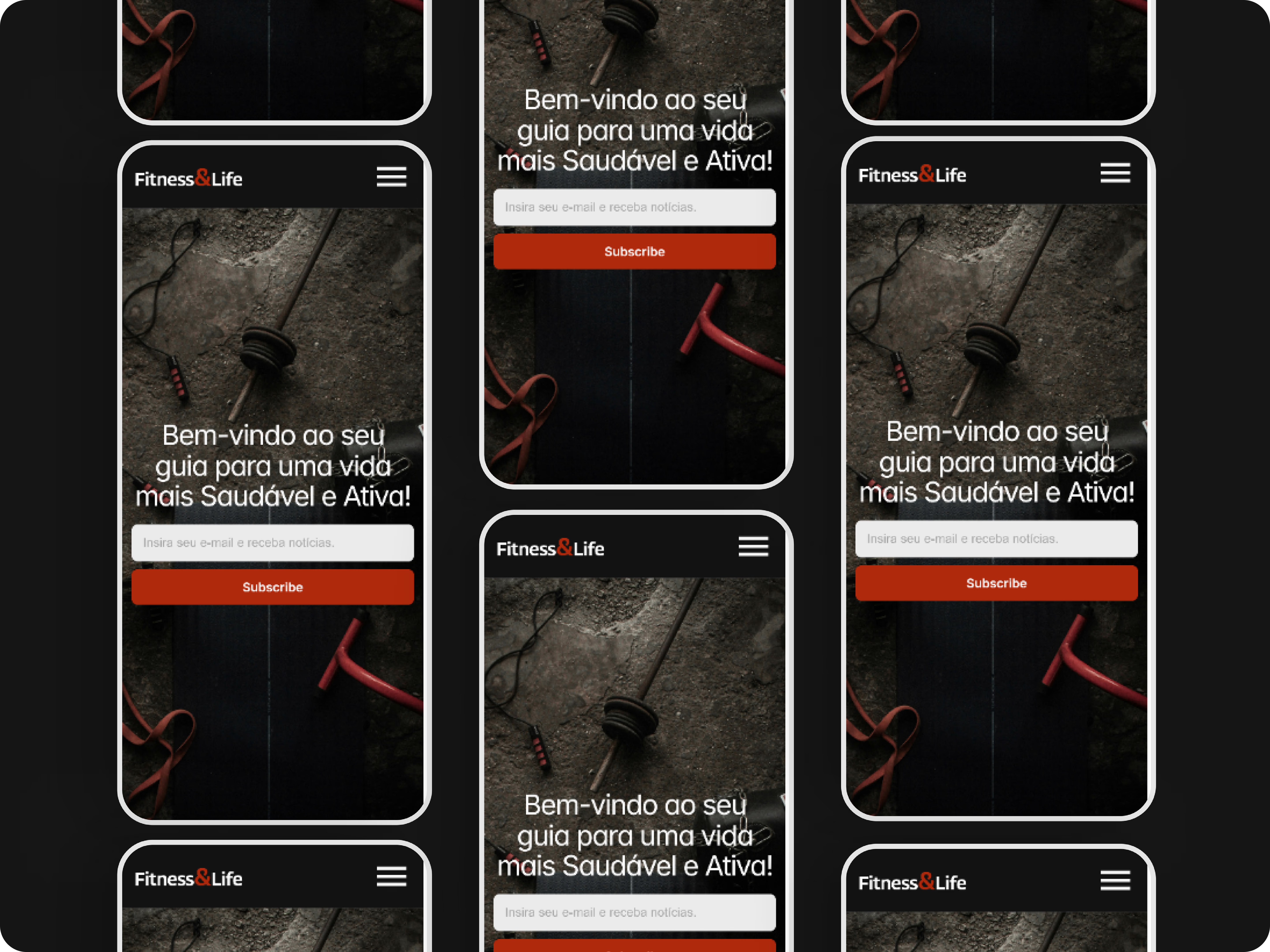
Responsive layout — design adapted for mobile devices