Summary
Soundbite is a study project where I applied UI and UX Design principles — including Nielsen heuristics and cognitive biases — to create a launch landing page for a fictional music and podcast app. The project was developed under the guidance of professor Kácio, combining Figma and Framer in a complete design-to-implementation workflow.
The Challenge
Create a landing page that presented the features, benefits and pricing plans of a music entertainment app. The page needed to be clear, responsive and conversion-focused, communicating the app's value proposition in an engaging way.
Design Process
- Style guide: I created the visual identity using the Lexend typeface, chosen for its readability and comfort. The color palette reflects the vibrant essence of the app
- Figma components: Complete design system with reusable components, ensuring visual consistency throughout the interface
- Copywriting: I defined the content and copy for each section to create a site that engages visitors and drives them to action
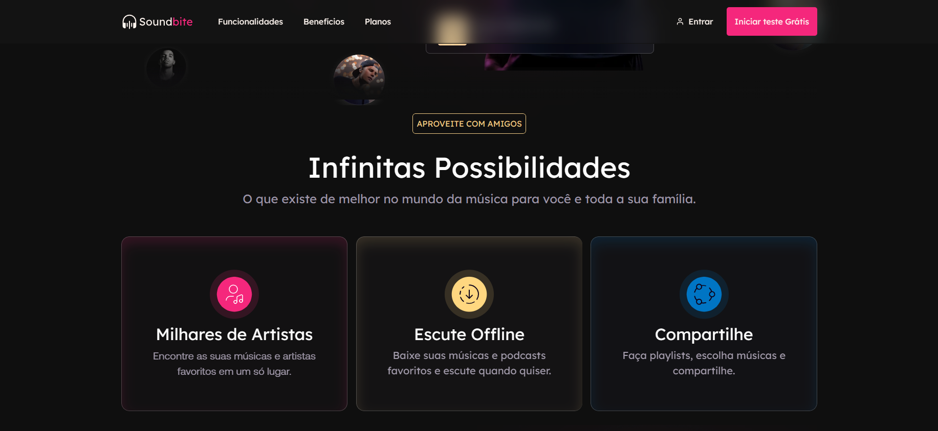
Infinite possibilities — thousands of artists, offline listening and sharing
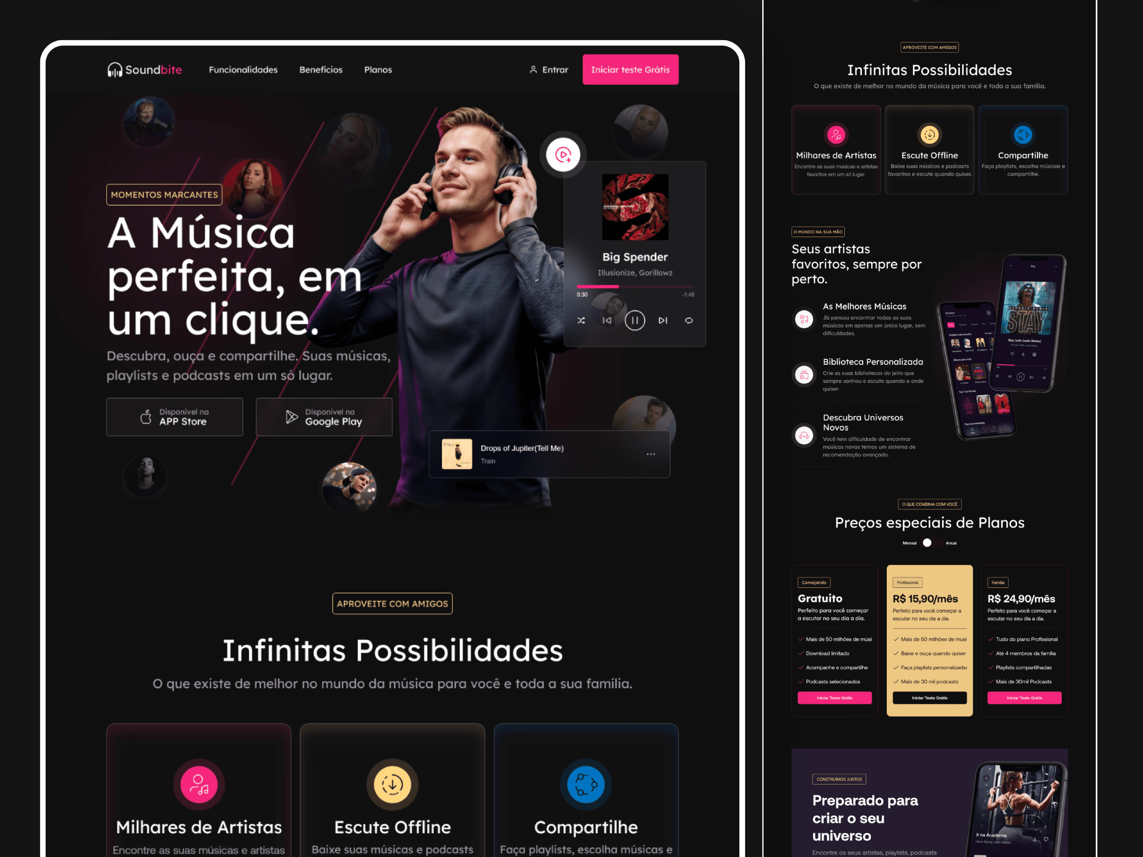
The Solution
I built a clean and eye-catching landing page in Framer, highlighting the app's features and pricing plans. The design uses subtle animations and a minimalist layout, ensuring clarity and smooth navigation.
The hero section was designed to make an immediate impact, with striking visuals and direct phrases communicating the main benefits. The call-to-action button, highlighted in a contrasting color, encourages visitors to explore further.
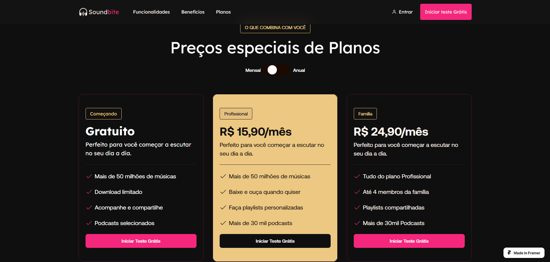
Plans — Free, Professional (R$15.90/mo) and Family (R$24.90/mo)
Learnings
The project reinforced the importance of bridging prototyping with real implementation. Using Figma for the design system and style guide ensured visual consistency, while Framer allowed me to transform the prototype into a functional and published website — exercising the complete design-to-production workflow.
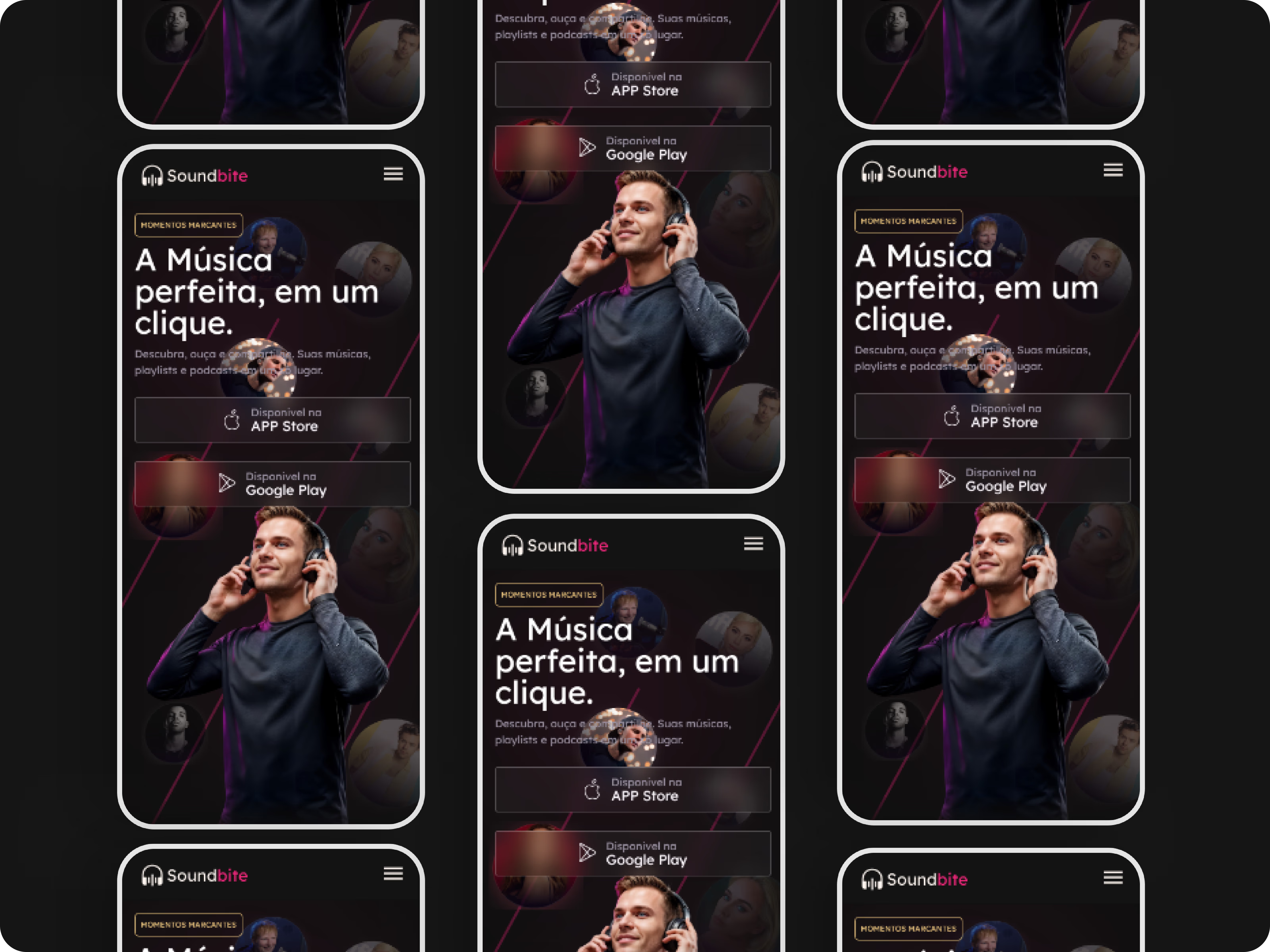
Responsive layout — hero section adapted for mobile devices